Coverlicious is a feature that I hold here on this blog featuring book covers that I love, lookalike covers and US v. UK covers.
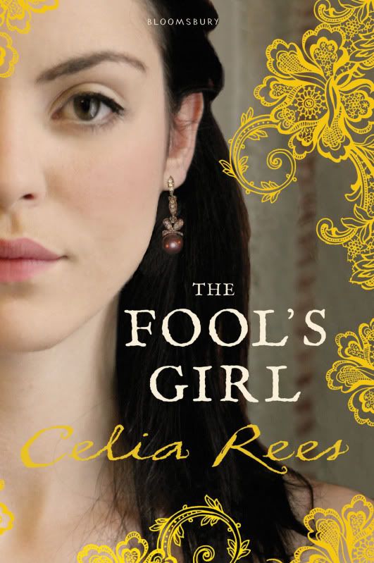 |
| The cover that I have |
 |
| Another cover that I found |
The cover on the right that I have is my favourite because it is much more striking with the vivid colours and pretty decoration along with the clear outlines. It also makes it look more Shakespearean/ Illyrian and Violetta looks more like I imagine her here (even though you can't see her full face on the left cover.)
The more pastel and subtle colours of the right cover would make it blend in more and I think that it would be less appealing to teenagers because it makes it look more like adult historical fiction. Also, I have found similar images of a girl with a hand on her heart on other covers which makes it look less original and like the writing has just been put over the top quickly. I just don't feel it portrays or captures the wonderful imagination of the writing.
This is a slightly different version of the cover I have. I love the warmth of the blue background rather than the grey as it brightens the cover up but I think the fancier writing and enlarged author's name makes it look more cluttered and detracts from the decoration. I can't decide a favourite between those though!
What do you think?
Look out for a review of The Fool's Girl in the next few days!


I prefer the cover showing the girl's dress, but then I am an adult, so maybe that just proves your point :P
ReplyDeleteI haven't read this book but I loved Celia Rees' "Witch Child". What is this one about, and is it worth a read?
Sam at Tiny Library
I actually love both.
ReplyDeleteThe one to the left looks elegant and the one to the right looks more mature.
Both great!
Though I do agree, the writing [on the third image] does look a little cluttered.
-Ria
Oh, I definitely want to read it now, I love "Twelfth Night". Thanks for the recommendation :)
ReplyDeleteHmmm...I think I like the one with the blue background best. The blue is pretty and it makes everything else stand out more.
ReplyDeleteThe one with the girl with the hand on her heart reminds me a lot of The Education of Bet by Lauren Baratz-Logsted (haven't read it)...actually wow, it really does look similar, even the dress is the same style.
Danya... I think it is the same picture, but photoshopped to change the dress color! It was also used on another book, Whisper my Name by Jane Eagland. I wonder if the fact it was so similar to two other YA historicals releasing at the same time is the reason they changed the cover. That picture was only used on the US advance reader copies and the US hardcover has the one pictured above with the blue background.
ReplyDeleteI've replied to Danya, Sam and Ria on your blogs but I forgot to copy and paste it here!
ReplyDeleteThanks for comments, it's lovely to know your opinions.
Danya- I noticed that too before I wrote this and I'm going to do another post about the similarities. I think you're probably right Rebecca but I'm really glad that they did change it. I think they must be cutting down on money by using a stock image from a photogrpaher.
I've replied to you all on your blogs but I forgot to copy and paste it here!
ReplyDeleteThanks for all your comments, I love knowing your opinions.
Danya and Rebecca- I noticed this before I wrote the post which is why I don't like the right cover as much. I'm going to do anothr post on it. I think you're probably right about the photoshopping, most likely the publishers were trying to cut down on money by using a stock image from a photogrpaher. I'm so glad they changed it in the end though!
And yeah, I'm glad they changed it too! In addition to the covers looking so similar I don't think the dress really fit the time period of The Fool's Girl. The other books were set in the 19th century and the dress looks like it's more from that time period instead of the 16th century.
ReplyDelete