Coverlicious is a feature that I hold here, where I do spotlights on different things to do with covers from photos of cover art from different editions of book and trends in cover art to comparing US and UK versions of a cover or simply just posting about a cover that I have fallen in love with. I'm intending just to feature Coverlicious posts here but if you would like to join in or do a guest Coverlicious post, please see my contact page.
Cover Wars
The cover on the right is very pink and girly and is in the style of the Princess Diaries which is quite a nice theme within Meg Cabot's books. It might also make fans of her more likely to pick the book up.
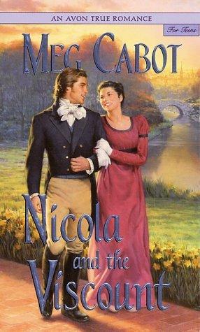
The middle cover was created to fit in with the rest of the Avon Romance for teens series (which was created so by Avon Books so that teenagers had clean romance alternatives.) However, I think that it would not appeal to teenage girls as much and it looks more like the typical adult romance cover. Also, the background is set in the countryside whilst most of the book takes place in London and Nicola's first love interest never visits her countryside home with her. It is perhaps the most romantic and I don't dislike it but it is not my favourite.
The cover on the left is probably my favourite, I like the blue sky and London background along with the main character Nicola in the centre. I also love the purple swirly writing, which adds to the girly and fun feel. Although, I don't like the 'squarish' and plain large capital letters printing Meg Cabot's name because they are too big and detract from the main part of the cover.
What do you think?


I have an award for you :)
ReplyDeleteHere: http://splashofourworlds.blogspot.com/2010/11/giveaway-additions-award-new-author.html
I like the middle one the best because I think it looks more historical, less modern.
ReplyDeleteinsane how they are so different! I am a new follower
ReplyDelete